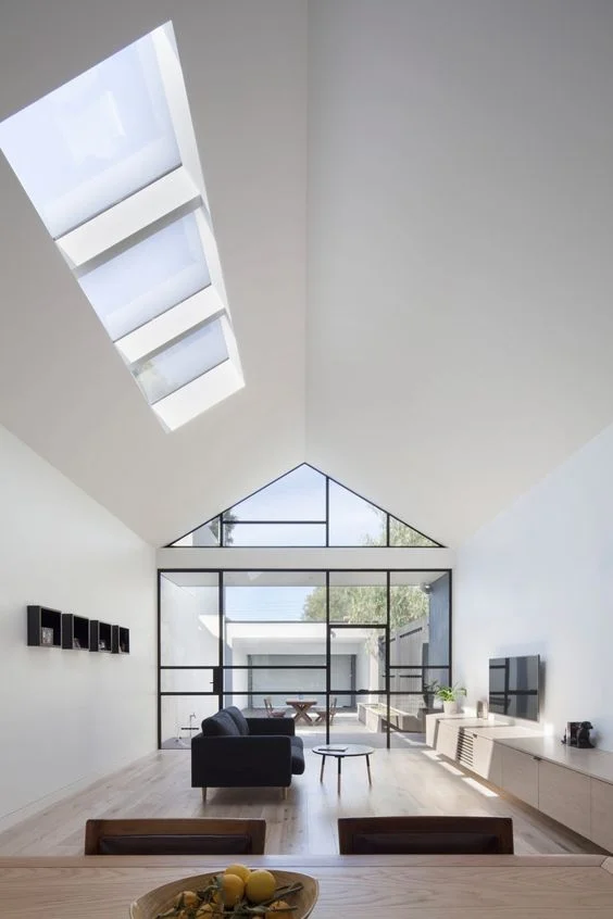
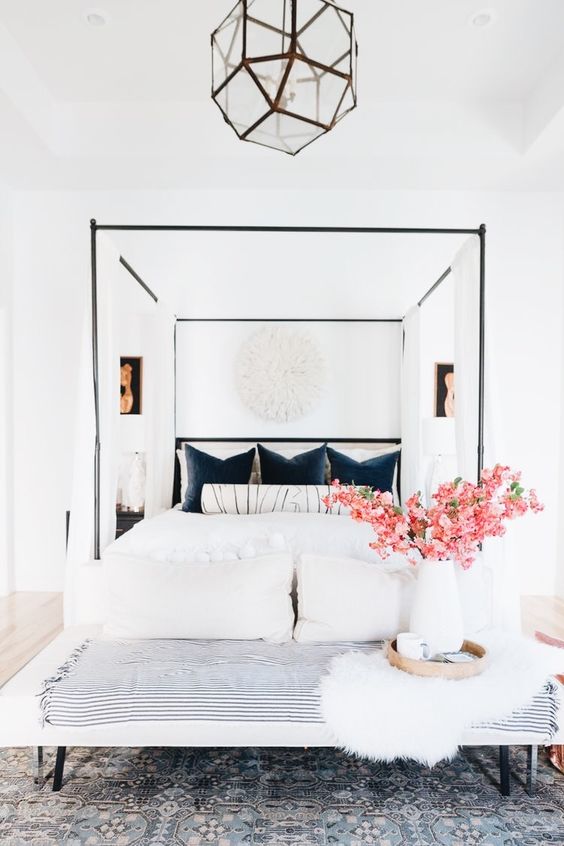
Minimalism is clean, restrained and cool, maximalism is raucous, bold and warm. The minimalist is efficient and precise, while the maximalist is extravagant and flamboyant. Interior designs tend to lean to either of the two extremes and no design theme is ultimately better than the other. It will all depend on the designer and the homeowner. A maximalist person might see minimalist designs as boring, while the minimalist can be overwhelmed by the maximalist designs.
First, you have to know if you are a maximalist or a minimalist person. Here are eight key design landmarks that differentiate the maximalist to the minimalist. Knowing the details of the design could help you decide if which you prefer;
1. Colours
Colour themes differ widely from maximalism to minimalism. The maximalist design would use a lot of bright and bold colours. The room could be a raucous compilation of different tones from one colour group or a wild mishmash of all the colours in the colour wheel. On the contrary, a minimalist design will subscribe mostly to neutral colours and earth tones. A minimalist room will only have one, two, or three colours at the most.
2. Lines
The structural line of the design can tell a lot if it is a maximalist or a minimalist. The maximalist would use a lot of curves, shapes and intricate details. Whereas the minimalist would stick to straight, thin and uncluttered lines.
3. Walls
The walls of a maximalist interiors will likely to be covered with frames, features and other detailing. It can be wallpapered in bright prints or flowers. On the other hand, the minimalist walls will likely to be bare or painted with a neutral colour, often unadorned.
4. Furniture
A maximalist room is usually full, if not crowded with furniture. Bulky, curvy and brightly coloured furniture and accent pieces are commonplace to a maximalist design. The minimalist room will have a lot less furniture and accents. Every piece will have a specific purpose and will usually be efficiently designed, sleek and in neutral colour.
5. Floors
The floor is another canvas for the maximalist designer to cover. They are often covered in carpeting, one or more colourful rugs, marvellously-veined marble or bright patterned tiles. Floors of minimalist designs are often kept bare. No carpets or bright rugs. It could be plain concrete, tiles in neutral tones or bare hardwood.
6. Ceilings
It is not uncommon for maximalist ceilings to be dressed up. The simpler designs would include basic crown mouldings, tray ceilings or coffered. Lighting fixtures are mostly extravagant and elaborate. Grander designs will feature paintings, wallpapers and elaborate crown mouldings. Ceilings of the minimalist interiors are likely unadorned except for the lighting fixture.
7. Prints and Patterns
A maximalist home is filled to the brim with a wild profusion of prints and patterns. It could be a combination of several prints and patterns, all bold and colourful. The minimalist is the opposite, using only the most demure of prints and simplest patterns in one or two shades of neutral colours.
8. The Blank Space
For the maximalist, the blank space is an opportunity to add an accent or a décor. Thus, small pieces of furnishings or décors are added to complete the look. In the minimalist world, blank spaces are sought and desired. Thus, unimportant furnishings and accents are removed from the room.
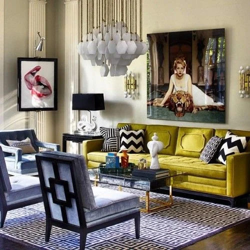
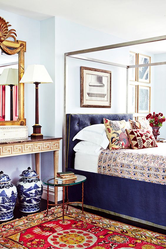
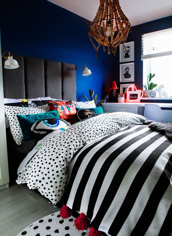
While minimalism is still on rage, a lot of interior designers are talking about the maximalist comeback – soon. Here are some modern maximalist designs we love;
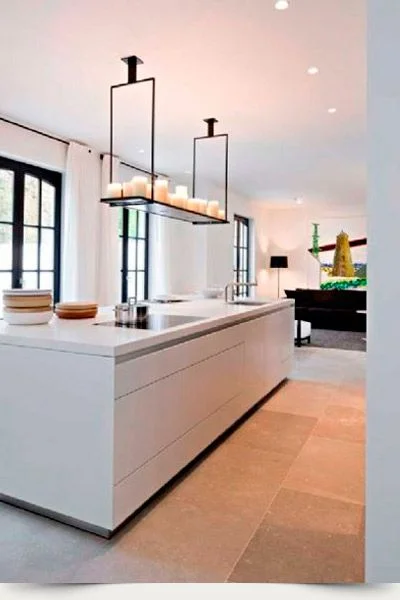
Here are some classic minimalist interiors that are guaranteed to withstand trends and style changes;
Do you have any beautiful and amazing maximalist and minimalist ideas and designs to add? Why not discuss it on our RenoForum!


